Too big to ignore:
How counting people in prisons distorted Census 2000
By Rose Heyer and Peter Wagner
Prison Policy Initiative
April 2004
Section:
Impact on race, ethnicity and age statistics
Because of the large racial disparity in incarceration, there can also be a subtle change in how the racial distribution of a state is portrayed in the Census. Census 2000 shows that predominantly White Franklin County New York more than doubled its Black population since 1990. That would be news to both the residents of the county and the prisoners, neither of whom consider the prisoners to be residents of Franklin County. Ninety-one percent of Franklin County’s Black population is incarcerated in the county’s 5 state prisons.
Nationally, many counties report that a quarter, half, or even more of their Black population is incarcerated. This does not necessarily reflect a bias in the county’s criminal justice system; rather it reflects a geographic bias in how the Census counts incarcerated people as residents of the prison facility. Even when we exclude counties that have only small Black populations incarcerated, the number of these quirks remains significant enough to undermine the value of Census data. (See Figures 9 and 10.)
This frustrates attempts to examine the evolution and migration of Black demographics. One typical study is a map entitled “Percent Change 1990 to 2000, One Race: Black or African-American” in the Census Bureau’s excellent Mapping Census 2000: The Geography of U.S. Diversity. (See Figure 11.) The map attempts to illustrate the growth of the Black population of every county in the country, but the Census’ enumeration of prisoners as local residents leads to misleading results. For example, Black Americans are not being drawn for jobs or retirement to rural Oregon, Nevada or Michigan. Rather, they are being sent to these regions against their will for temporary placement in a correctional facility. These growth statistics do not reflect the community’s actual character.
A similar effect can be seen in Mapping Census 2000’s illustration of the age distribution of Hispanics. (See Figure 13.) Nationally, 25.7% of people of all ethnicities are under the age of 18. This varies from place to place, in part because of where people of certain ages choose to live. For example, many older people move to Florida, so that state has a very low proportion of young people.[10] Nationally, Hispanics are a much younger population than the total U.S. population, as 35% are under the age of 18. Unfortunately, it is hard to tell whether there are any relevant age-based trends in Latino migration for economic or social reasons because the data is overwhelmed by the number of adult Latinos moved to counties against their will for purposes of incarceration. (See Figure 14.)
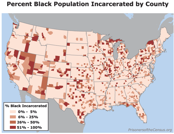
Figure 9. Many counties report that a large percentage of their Black population is incarcerated. From the Census data, it would appear that some of these counties have local policing and judicial systems with extreme racial biases. That may or may not be true, but what the data actually represents is a tendency on the part of state and federal authorities to construct prisons in counties that are not necessarily similar to the communities where most prisoners originate.
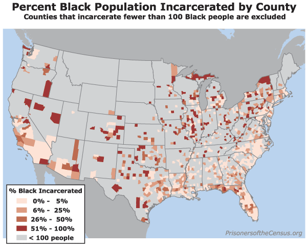
Figure 10. Because many counties are small, and because many counties share regional jails, counties with very small Black populations may appear to be significant incarcerators of Blacks when they are not. This map excludes from consideration counties that report less than 100 Black incarcerated residents in the Census. When these small counties are removed from the analysis, the number of statistical quirks caused by the Census Bureau’s usual residence rule remains quite significant.
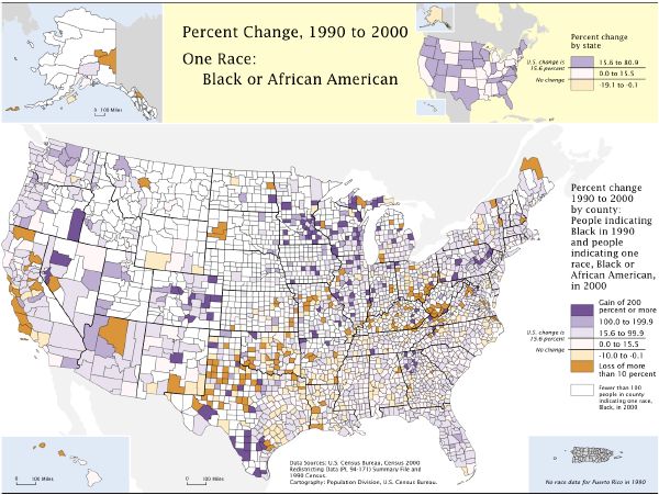
Figure 11. Many counties (in dark purple) report significant Black populations doubling in size from 1990 to 2000. In many of these cases, the cause is not willing Black migration, but the construction of new prisons. (Map source: U.S. Census Bureau, Mapping Census 2000: The Geography of U.S. Diversity.)
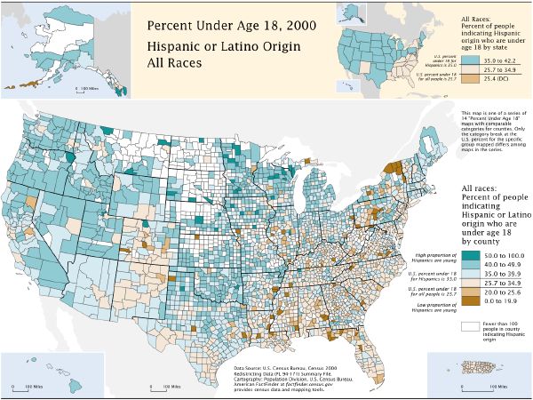
Figure 13. Many counties (in dark brown) report a significant Latino population, but report few Latinos under the age of 18. In most of these cases, this is not the result of people deciding not to have children, it’s the result of the Census counting large Hispanic prison populations as residents of counties that otherwise do not have a significant Hispanic population. (Map source: U.S. Census Bureau, Mapping Census 2000: The Geography of U.S. Diversity.)
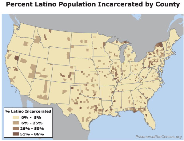
Figure 14. The Census reports that many counties have a large percentage of their Latino population incarcerated in correctional facilities.
Footnotes
[10] Cynthia A. Brewer and Trudy A. Suchan, Mapping Census 2000: The Geography of U.S. Diversity, Census Bureau, p. 17.
Recommended Reading:
About the Prison Policy Initiative
Learn more about the organization behind the Prison Gerrymandering Project.

In prisons, Blacks and Latinos do the time while Whites get the jobs
We explore the racial disparity inside prisons.

McAlester, Okla. ends prison gerrymandering, Census Bureau can do better
McAlester, Okla., finally ended prison gerrymandering after a decade of trying. It's time for a national solution.

Prison-based gerrymandering's historical precedent
This is not the first time a policy barred people of color from the polls and transferred their political power to white voters.