Ohio’s migration to prison, as seen through the Census
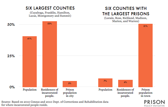
More than half of the incarcerated people in Ohio come from just 6 populous counties, but more than half of the state's prison cells are located in just 6 small counties
by Peter Wagner, October 10, 2013
I just completed a remote presentation about our research on prison gerrymandering in Ohio. While preparing my talk, I discovered a new way to explain our map and data table about where incarcerated people come from and where they go in Ohio. In a sentence:
More than half of the incarcerated people in Ohio come from just 6 populous counties, but more than half of the state’s prison cells are located in just 6 small counties:
And if you are intersting in bringing PPI speakers to your organization — in person or remotely — please get in touch.


